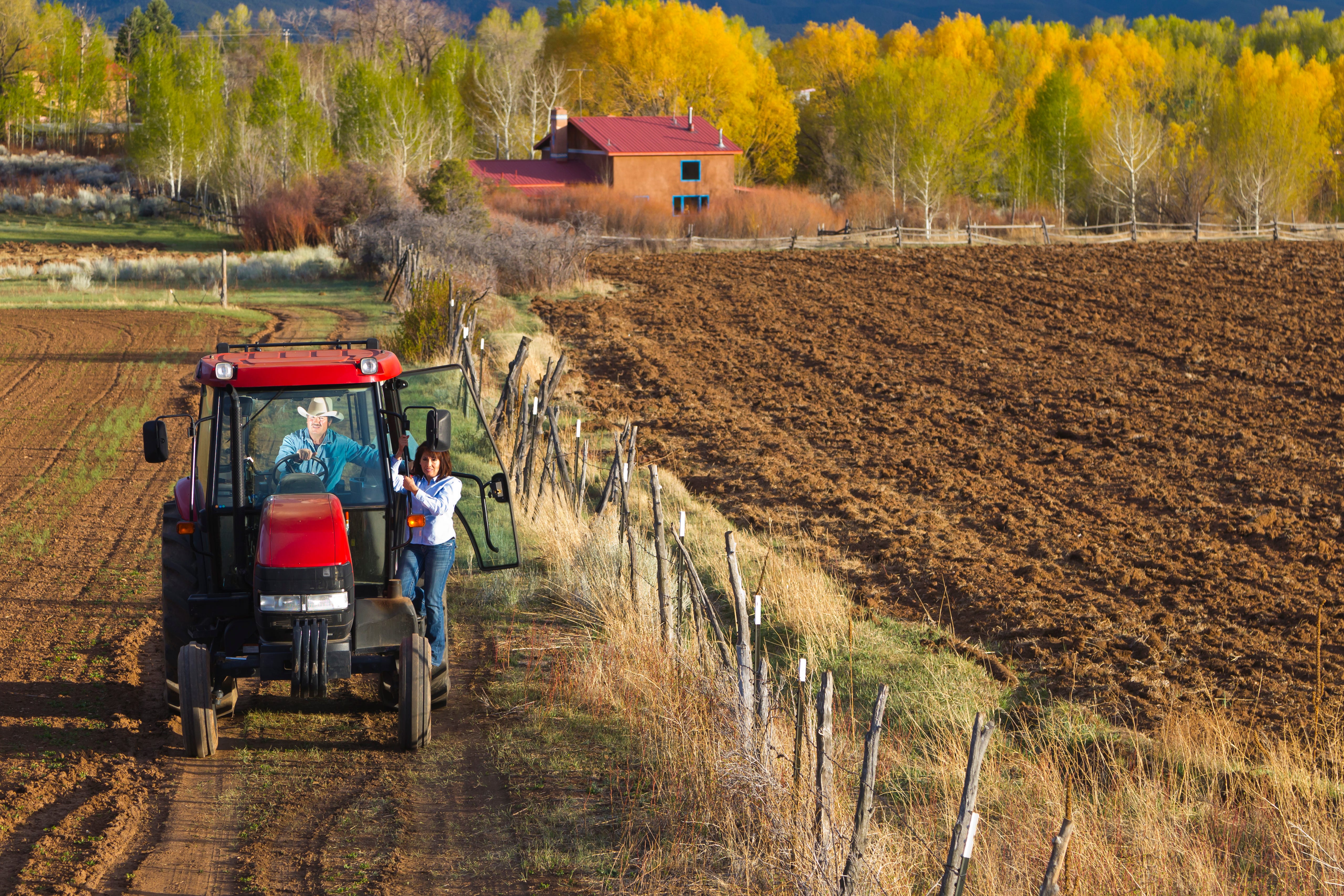
A farming couple works the land. (Photo by Michael DeYoung via Getty Images)
Along with my controversial view that dogs aren’t people, a subtly significant claim I believe to be accurate and consequential is that farms aren’t nature.
I think the vast majority of people, including people with a healthy appreciation for the value of economic growth, think there’s an important role for public policy in preserving nature. The exact nature of that role is, of course, controversial. You don’t see Donald Trump pushing to sell the Grand Canyon to build a golf course or California YIMBYs calling for midrise apartments in Yosemite. But outside of the most obvious examples, people have somewhat different intuitions as to what nature even is.
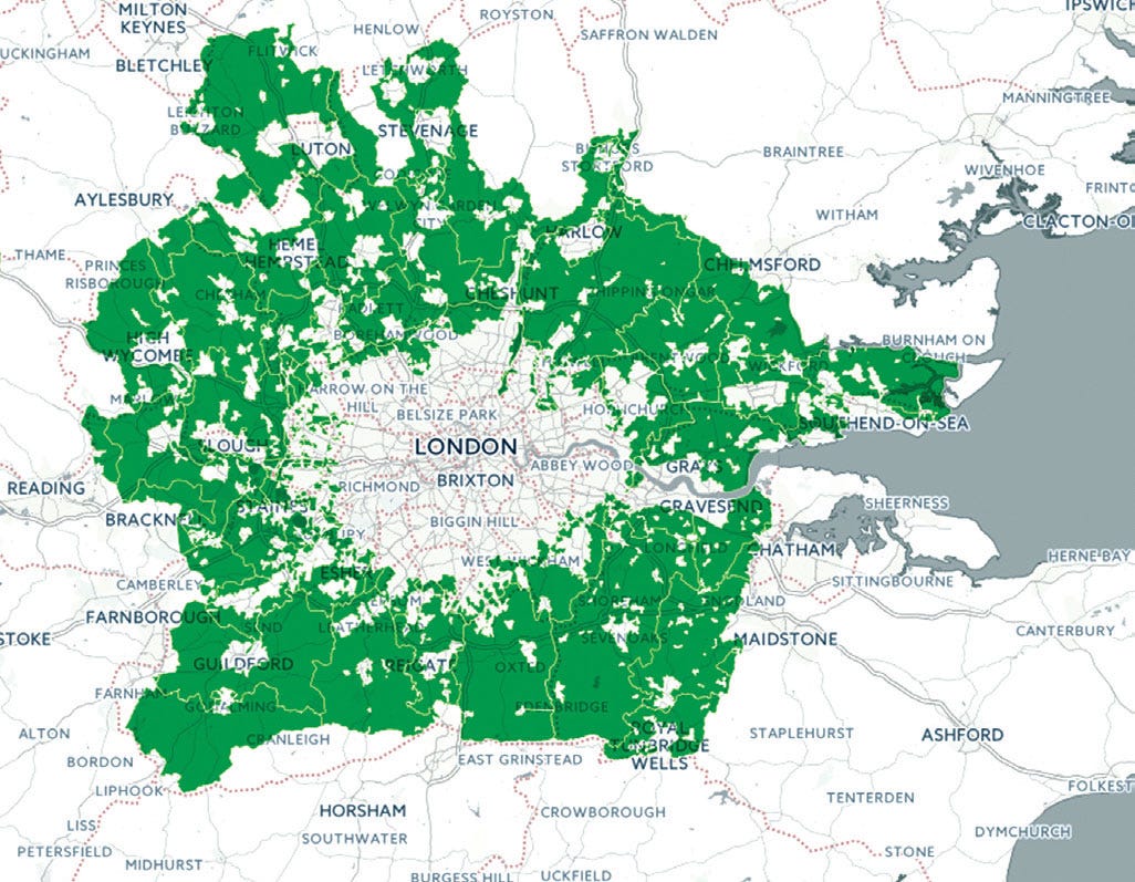
For example, London (like other British cities) is surrounded by an extensive green belt in which housing development is heavily restricted. This is obviously a costly economic policy given the country’s acute housing shortage. What I think is not clear from the map is that the “green” in the green belt is not parks or woodland but mostly farms with a smattering of golf courses and other sports facilities.
In the United States, we don’t typically have policies like that. One exception, though, is that Montgomery County in the D.C. suburbs has an extensive Agricultural Reserve where, similarly, suburban sprawl is banned.
But what you get in exchange for the development ban is not parkland or nature preserves but (mostly) small farms that absent regulation would not be an economical use of the land. Many of these appear to be hobby farms or derive the majority of their revenue from use as wedding venues or the like. Regardless, the Agricultural Reserve is, in effect, a kind of super-duper large-lot zoning, not a “conservation” policy as I would understand it.
Freddie deBoer called me out the other day for some intemperate remarks on British cultural and political attitudes toward housing, and I think he had a basically fair point. I try to advocate for pragmatic, non-expressive politics, and when it comes to the United States of America I think I do a pretty good job of it. Since I don’t actually live in Britain or cover British politics professionally, it can be fun to mouth off. But it’s bad practice. So I’ll say that I do not really understand the culture, legacy, or history of these British green belts. I will simply observe that in the United States of America, we do not normally understand farms to be part of the category of “nature” that we are trying to protect with environmental law, and this is a strength of American society. But we do have exceptions, and I’m a bit concerned that these exceptions are growing.
I’m writing from Maine, a state renowned for its natural beauty.
It’s also a state that after decades of population decline has seen rapid population growth since Covid, which is creating a lot of pressure on housing prices. That’s especially true because the places where remote workers want to live — and therefore where people who want jobs doing locally facing services for remote workers want to live — are not necessarily the mill towns that lost population during the decline years. The state has passed some major YIMBY laws to address the housing crisis, but I think common sense says that the state will also want to take measures to ensure the preservation of the aforementioned natural beauty.
In a conservation easement, a landowner stipulates that future development will be restricted on all or part of a property. Enforcement of the conservation easement falls to one of the various land trusts that exist around the state. The restriction reduces the fair market value of the property, which generates an income tax deduction (and, if applicable, estate tax savings) while also lowering the landowner’s property-tax liability. In exchange, the status quo is preserved.
This broadly makes sense to me. The former owner of a property I can see across the water from my house placed it under a conservation easement in partnership with the Maine Coast Heritage Trust. It is nice to look at from afar and makes for a fun, easy hike to take visitors on.
But there’s no legal requirement that a conservation easement involve opening the land to the public like this. What’s more, there’s not even a legal requirement that it be a nature preserve! From a tax standpoint, what’s going on is that by forswearing development rights, you are reducing the value of the land.
Nearby, the Blue Hill Heritage Trust has a Farmland Forever program that encourages people to create conservation easements that stipulate that land cannot be used for future housing development because it’s going to be a farm.
It’s of course true that if you take a parcel of land that could potentially be valuable if subdivided into housing and say “nope, this is going to be a farm forever,” this reduces the economic value of the land. But is giving a person a tax break for doing something economically perverse with a parcel of land really a good idea? What if a plumber had agreed in 2002 to stipulate that his plumbing business would never use cell phones or email or launch a website? That would reduce the value of the business. But you wouldn’t want the tax code to encourage people to run their businesses in a dumb way.
You can even go to fundraising dinners at the local country club where upscale residents will, I guess, donate money to the cause of encouraging people to get tax breaks for restricting housing development on their land.
It seems like it’s basically just NIMBYism with a vague high-minded gloss.
Blue Hill Heritage Trust grimly warns that “as land values rise and properties are subdivided, agricultural land can quickly be converted to housing and other uses. Once these productive soils are developed, they are effectively removed from agricultural use forever.” That may or may not be true, but it’s absolutely true that once land is placed under a perpetual conservation easement barring residential development, it is (by definition) removed from residential use forever. And for what? Small-scale New England farms haven’t been a major part of the American economy since railroads were built in the late 19th century.
Which, of course, is not to say that people shouldn’t be allowed to operate farms in Maine or wherever else they want to. I like farmers’ markets and paying a premium for fresh local produce as much as the next upscale liberal.
But I also want people to have places to live and reasonable commutes. I want builders and the people who manufacture the stuff that goes into homes to have jobs. I want towns to have tax revenue so they can support schools and roads. Bearing an economic cost to preserve nature seems reasonable to me. But part of how you get there is you allow more development so your town has a larger revenue base. That lets your town acquire more choice parcels for parkland rather than just freezing random small-scale developments in amber.
The big tradeoff
Cutesy farms in cutesy coastal towns are a kind of funny edge case for both nature conservation and agriculture.
What I think is underappreciated, though, is the tradeoff around the large commercially viable farming operations that genuinely underpin the American agricultural sector and, to some extent, the entire global food system.
These farms are mostly not cutesy, and people express relatively little desire to preserve them. Indeed, they often express the desire to have less nasty “agribusiness” and more cutesy farms.
The problem with this is that, as Michael Grunwald’s great book on agriculture from last year points out, the big nasty commercially viable farms are the way they are because they are dramatically more efficient. A single cutesy farm in a cutesy town looks nice, but it’s not producing enough food to feed the town. Agriculture that is less intensive, less efficient, and more localized would require widespread deforestation. And yet even with relatively intensive modern methods, the national footprint of agriculture is much larger than all the cities and suburban subdivisions and strip malls combined. Over a third of federally owned land is used for grazing.
I’m not going to say that this is bad; obviously, it’s good to have food.
But it does underscore that biofuels subsidies are a crazy agricultural policy. Shrinking the footprint of nature in order to grow more corn in order to turn corn into a gasoline additive is ridiculous — especially if you keep in mind that farms aren’t nature.
I heard Bill McKibben tell Ezra Klein recently that America doesn’t need more energy because “we already use huge quantities of it, and we use it strangely.” This is wrong, though. If we had much more abundant energy, then vertical farming would be economically viable for at least some crops and we could get by with much less farmland — and much less pesticide — and have more room for homes and for nature.
And that’s the general point. If you’re interested in the subject of human activity encroaching on the natural realm, then agriculture is by far the main way in which this happens. If you adopt a kind of anti-urban, anti-housing politics whereby farmland is conceived of as a form of nature, you not only end up engaging in costly forms of farmland preservation, but you ultimately undermine the goal of preserving actual wild landscapes, wildlife habitats, and recreational amenities.
President Donald Trump holds a printed copy of a post from his Truth Social account about the Safeguard American Voter Eligibility Act as he speaks in the Oval Office of the White House in Washington, DC on June 4, 2026.Brendan Smialowski—AFP/Getty Images
As Republicans—one of us represented Wisconsin in Congress, the other served as governor and attorney general of Pennsylvania—we come from different states with different election systems, but we share the same conviction: only eligible American citizens should vote in American elections, and the public must have confidence that our elections are secure.
That is why we must demystify local election administration and build trust in the people and processes that make our elections work. And it is precisely why we are concerned about the SAVE America Act.
The bill’s central premise is popular: noncitizens should not vote. We agree. However, federal law already prohibits noncitizens from voting in federal elections. Pennsylvania and Wisconsin laws, like those of other states, already require voters to be U.S. citizens. Election officials in both states already use multiple safeguards to verify eligibility, maintain voter rolls, and investigate potential violations.
The real question is not whether noncitizens should vote. The question is whether this federal bill solves a real election-administration problem in a careful, workable way—or whether it creates new problems for millions of eligible citizens and the local officials who run our elections.
This is where the SAVE America Act falls short.
The legislation would require documentary proof of citizenship to register to vote in federal elections, along with photo identification to vote. In practice, that means a standard driver’s license would often not be enough. A REAL ID may not be enough either, unless it indicates citizenship. Voters would generally need a passport, passport card, birth certificate paired with photo identification, naturalization papers, or another qualifying document.
That sounds straightforward—until one considers how Americans actually live.
A young voter registering for the first time may not have a passport. A married woman whose legal name no longer matches her birth certificate may need to produce additional documentation. A rural voter may have to travel a long distance to an election office. A low-income worker may struggle to take time off during business hours. A service member stationed away from home may face barriers that civilians never encounter. A citizen who has voted for decades may suddenly need to produce paperwork simply because they moved, changed names, or updated their registration.
These are not theoretical concerns. They are ordinary facts of everyday American life.
Wisconsin already has one of the more stringent voter ID systems in the country. Voters must present an acceptable photo ID when voting, and voters registering in Wisconsin must provide proof of residence. The state’s system is administered locally by municipal clerks who know their communities and are accountable under state law.
Pennsylvania takes a different approach, but it, too, has safeguards. To register in Pennsylvania, a person must be a U.S. citizen, a resident of the commonwealth, and at least 18-years-old by Election Day. The state’s automatic voter registration system at PennDOT is designed so that only applicants whose records document eligibility are presented with voter registration screens, and county election officials review applications before registration is finalized.
Plus, there is another key concern that Republicans should not dismiss. Our Constitution leaves election administration largely to the states, within a framework set by federal law. Wisconsin and Pennsylvania do not run elections the same way. Nor do Arizona, Georgia, Michigan or North Carolina. That diversity is not a defect. It allows states to build systems suited to their laws, populations and traditions while still meeting national constitutional standards. It is crucial that Republicans stand up for states' rights—including now.
In Pennsylvania, a divided government has not prevented election reform. Harrisburg currently has a Democratic House and a Republican Senate, and the legislature has passed bipartisan changes to the election code after extensive input from county governments. That is how election policy should be improved: through state-level experience, local feedback and practical reforms shaped by the officials who actually administer elections.
A rushed federal overhaul would impose one blunt solution on thousands of local jurisdictions. It would also ask election officials—already strained by turnover, threats and public mistrust—to implement complicated new requirements. That is not a recipe for confidence. It is a recipe for confusion.
We understand why many voters worry about election integrity. Through our work with the nonpartisan civic education organization Keep Our Republic in battleground communities, we have heard real skepticism and frustration from citizens, election officials, lawyers and local leaders. Those concerns should be taken seriously. But taking voters seriously does not mean endorsing every bill labeled “election integrity.” Some proposals strengthen trust. Others create confusion, burden eligible voters and weaken the state-based systems that already protect our elections.
Real election integrity requires accuracy. It requires transparency. It requires telling voters what is true even when the truth is less politically useful than the fear.
Noncitizen voting is illegal. When it happens, it is investigated and punished. States should continue strengthening their safeguards. But the evidence does not support the claim that noncitizen voting is occurring at a scale that justifies burdening millions of eligible Americans or overriding state election systems with a sweeping federal mandate.
We believe Republicans can be the party of secure elections, limited federal power, competent administration, and personal responsibility. The SAVE America Act, as written, does not live up to those principles. The American people deserve election laws that make it easy to vote and hard to cheat.
Election confidence is built by facts, transparency, and trustworthy administration—not by panic, paperwork, and political ultimatums.
Hello again all. It is once again the week of July 4th and so, as is customary here, I am going to use this week’s post to talk about the United States. This is going to be a bit more of an open musing than an argument as compared to previous years (2021, 2022, 2023, 2024, 2025) because my attention has been turned this way and that over the past few weeks and then just when I thought I’d be able to focus on this, one of home ownership’s many annoyances (a busted pipe) cropped up to consume much of the week.
Nevertheless, the Declaration of Independence turns 250 this year – ratified on July 4, published on July 6, read aloud in public on July 8, 1776 – and I want to muse on it a bit, with some focus to the actual text. Americans revere our founding documents (the Declaration and the Constitution) but I fear we do not read them very often. I was a ‘pocket-constitution’ kind of fellow in college, but one is regularly shocked by how little the average American citizen understands about how their government functioned or what the ideals of the framers were and one is regularly disappointed, but very much not shocked, by the endless parade of political entrepreneurs looking to exploit that gap in knowledge.
I will also note, for my international readers, that I think the exercise of looking at these documents is valuable, for the same reason I’ve made my students read Magna Carta or the Declaration of the Rights of Man and of the Citizen: these are documents of world-historic significance (hardly the only ones, of course, but they make ready examples). At some point, particularly in leftish circles, it became trendy to dismiss the American founding as a mere ‘bourgeois’ revolution in favor of later revolutions in Europe and I think this is a mistake. There quite possibly is no French Revolution without the American one; the cross-pollination of ideas is obvious. The American Revolution (and thus the Declaration) therefore must also play a role in 1848 and it very obvious plays a role in the advance of democracy in Europe after 1945 and again after 1989.
The Declaration of Independence was recognized as a radical, potentially explosive document at the time of its issuance, as we’ll see. And it was explosive: the world of 1775 was one dominated by monarchies with just a tiny handful of traditional republics (which we should not ignore!). It took a long time for the seeds of the declaration to spread, but the world it helped create is one where liberal democracies, while hardly universal (more people have always lived in unfree societies than free ones) represent the most economically and culturally dominant bloc in world affairs – something that had never happened before. The Declaration, in its way, remade not just the Thirteen Colonies, but slowly, surely, as water seeps through the cracks of rocks (or my floorboards, alas), it remade the whole world.
So if you haven’t, go read the text of the Declaration. It isn’t long (but don’t skip!). My thoughts at present don’t necessarily fit together neatly, so we’ll break them down under a few major headings.
The signed copy of the Declaration of Independence displayed in the National Archives in Washington D.C., engrossed by Timothy Matlack.
A Decent Respect to the Opinions of Mankind
When I was growing up, one of the things it was fashionable to argue was that the American Revolution was a ‘conservative’ revolution, in that it did not overturn the social structure of the Thirteen Colonies. Conservatives said this about the revolution to claim it for their own and to distinguish it as the ‘good’ revolution in contrast to those ‘bad’ revolutions in Europe and Latin America. Leftists sometimes did the opposite, terming the revolution ‘conservative,’ unlike ‘real’ revolutions which upended social and economic patterns more completely. And there’s not nothing to this: the revolution did not immediately challenge the socio-economic systems of the Thirteen Colonies (though the notion that the revolution was fundamentally pro-slavery is, at best, quite overstated; it was certainly not an anti-slavery revolution, either, of course).
I think both positions however, are fundamentally wrong, however, in that they miss the inherent radicalism of the principles of the Declaration. Indeed, the framers themselves seem to have only imperfectly understood the course of the rock they were about to set rolling. But they very well understood the momentousness of it.
Now there’s a tendency at this point to jump right to, “We hold these truths…” but let’s start at the beginning.
The unanimous Declaration of the thirteen united States of America, When in the Course of human events, it becomes necessary for one people to dissolve the political bands which have connected them with another, and to assume among the powers of the earth, the separate and equal station to which the Laws of Nature and of Nature’s God entitle them, a decent respect to the opinions of mankind requires that they should declare the causes which impel them to the separation.
The introduction of the Declaration doesn’t begin with self-evident truths, but rather an assertion that the action of the Declaration demands explanation, that “a decent respect to the opinions of mankind requires that they should declare the causes.” The framing speaks to the radicalism of what the authors (we tend to think of Jefferson as the sole author, but the finished Declaration was very much a creature of committee) are about to do, so radical that decency and respect requires them to explain themselves, not merely to the colonies or to the British Empire but to “mankind.”
The contrast with many similar documents is striking to me. Of course a lot of national declarations declare causes and aims of an action, but in my own – admittedly incomplete – survey, it is quite rare that any imagines that all of mankind needs to be informed. To jump back to the previous examples, Magna Carta calls to witness only John, his subjects and God. The Declaration of the Rights of Man makes its declaration before the “supreme being.” And that makes sense – there is, on some level, no need to inform mankind about those documents, because they pertain only to the people of specific countries (although the Declaration of the Rights of Man clearly has universalist aims).
By contrast, the authors of the Declaration seem very clear-eyed that they are about to make some claims with global, universal significance, that the collection of apple carts they are about to upset is rather larger than just their own. As we’re going to see, they’re right – because they’re not asserting the peculiar rights of Englishmen or British subjects, but rather making an argument about a set of universal rights and principles which might shake thrones and crack crowns the world over. That warning and assumption of responsibility – that the authors understand that the magnitude of their claims here require an explanation – is what leads into the bombshells of the preamble, though the introduction has already tipped its hand to one of them (that a “people” are entitled to a “separate and equal station” and thus able, on their own, to rightly dissolve the bonds that tie them with another).
The Radicalism of the Preamble
That stage-setting swiftly leads us into the Preamble.
We hold these truths to be self-evident, that all men are created equal, that they are endowed by their Creator with certain unalienable Rights, that among these are Life, Liberty and the pursuit of Happiness.–That to secure these rights, Governments are instituted among Men, deriving their just powers from the consent of the governed, –That whenever any Form of Government becomes destructive of these ends, it is the Right of the People to alter or to abolish it, and to institute new Government, laying its foundation on such principles and organizing its powers in such form, as to them shall seem most likely to effect their Safety and Happiness. Prudence, indeed, will dictate that Governments long established should not be changed for light and transient causes; and accordingly all experience hath shewn, that mankind are more disposed to suffer, while evils are sufferable, than to right themselves by abolishing the forms to which they are accustomed. But when a long train of abuses and usurpations, pursuing invariably the same Object evinces a design to reduce them under absolute Despotism, it is their right, it is their duty, to throw off such Government, and to provide new Guards for their future security
In the United States, at least, I think we hear these words so often as kids that we lose the sense of their importance and radicalism or even of their plain meaning, the way that if you speak any word enough times over again in a row it starts to feel like gibberish. So what is the preamble saying and why?
Fundamentally, it is building to an argument for the validity of independence in four consecutive points. Notably, whereas today, national independence movements often take it as a granted principle that a people ought to be free to make its own government, ought to be free of the domination of another people (the principle of self-determination), the Declaration assumes its reader thinks the opposite. It assumes a reader who accepts that monarchy and empire are both just and natural, for whom the idea of self-determination is at best dangerous nonsense. And that makes sense – almost none of the peoples in the world the framers knew were self governing (notable exceptions for the Dutch and Swiss). Instead, even when a people had their own country, they were ruled, rather than self-governing – by a king or a closed oligarchy (often a hereditary aristocracy), which often felt little if any cultural commonality with their own commoners.
That system was normal and indeed had been normal since antiquity: self-governing polities are very rare in the pre-modern period. It was not only normal, but normalized: centuries of literature and tradition supported the idea that the right and normal way to organize a society was through authority rather than self-governance. So the Declaration has to go to exceptional lengths to show why this monarchy and this empire have ceded any just claim to govern the colonies. In the process, however, it lays down the argument that leads to that modern assumption of self-determination.
The argument begins with two assertions. The first is a natural law assertion of an equality of rights among men, “that all men are created equal, that they are endowed by their Creator with certain unalienable Rights.” It is a claim of striking magnitude and remarkable finality – indeed, a claim of such magnitude that it very obviously conflicted with the practice of slavery in the colonies, something some of the framers recognized and then most shamefully did almost nothing about. The Declaration could have asserted those unalienable rights are being particular – to British subjects or Englishmen or Christians, perhaps – but it does not. Instead it insists upon their universality through an argument to natural law, a sensible choice for Thirteen Colonies that already had a multiplicity of faiths and ethnicity in them. Again, if that seems normal to us, it was not normal at the time and indeed is not normal now: most countries are not operated with the notion that anyone has unalienable rights (a reminder that at no point in human history have a majority of countries been anywhere remotely close to free).
We should also note that what the Declaration asserts are not collective rights, but rather individual rights, an important component of liberalism, but an enormous break with most pre-modern social assumptions, which tend to be communal, rather than individual. Compare for instance the ancient Greek notions of autonomia and eleutheria – autonomy and freedom – which in a political sense were really collective rights, possessed by the polis. An individual Athenian did not really have any rights that the Athenian demos – the people at large – were bound to respect. By contrast, the Declaration is asserting that all men individually possess key rights, including the ‘Pursuit of Happiness’ which is rather an expansion of Locke’s original “life, liberty and property” formulation – to me it includes not just a right to property but also a right to make one’s own decisions, to pursue one’s own goals, to not be a tool of the community. Again, this is a really radical rejection of the way most societies had been organized – as Patrician Crone notes, in pre-industrial societies, “the individual existed for the benefit of the overall group, not the other way around.” The Declaration asserts the opposite: the group (governments) exist for the individual.
The second assertion then follows on the first – drawing from John Locke’s theory of the social contract, the Declaration asserts that “to secure these rights, Governments are instituted among Men, deriving their just powers from the consent of the governed.” This is, as we’ve discussed many times, untrue as a matter of historical fact – states emerge as violence-machines, not as machines for the protection of rights. But as an aspirational statement, that governments and states ought to have the protection of rights as their primary purpose, ought to derive their powers from the consent of the governed, it is a powerful statement.
It was also really radical in 1776, at a point when most states on Earth justified their power not from the consent of the governed but rather by divine right: the ruler was chosen by God, or had the Mandate of Heaven, or was of a divine lineage, and so on. The idea that government was by divine sanction was hardly new – we find it in some of the earliest governing documents that still survive. It seems to have been the governing principle of the earliest states, that the social order – with the king on top – was divinely ordained and thus any attempt to challenge it was a rebellion against God or the gods. One sees strains of this in certain forms of Christian nationalism in the United States, which regard either the American form of government or specific American leaders as divinely ordained, but the irony is that the Declaration is quite directly rejecting this vision. “Their Creator” who is also “Nature’s God” does not ordain rulers, rather he endows rights which earthly rulers may not in justice abridge and which humans cannot alienate – which is to say the rights can never be lost, only violated.
The next two points then serve as conclusions which follow these two initial assertions: if individuals have unalienable rights and if governments exist to protect those rights then (this is the third point) a government which fails to protect those rights loses its legitimacy and may be disestablished and therefore (the fourth point) a “long train of abuses and usurpations” can justify revolution.
In short, a government – and it is striking here that the Declaration uses the king as synecdoche (part-for-the-whole) for the whole British government – which greatly fails in its duty of protecting rights loses its legitimacy. Once again, the authors seem to sense how radical that claim is and so they qualify it, making clear that such a decision isn’t to be taken lightly (and it isn’t likely to be taken lightly). The failure of the government in question to protect rights must be extreme to justify the radical cure of revolution, a position which will set up the bill of grievances that make up the actual bulk of the Declaration’s text (but which everyone skips – we shall not).
But before we move to the bill of grievances, I want to take one more chance to push back against the idea that the Declaration is just something ‘small ball’ or something that only mattered for the United States.
The Declaration was recognized as an incendiary, radical, dangerous document at the time. It was banned or suppressed in some European monarchies – not appearing in translation, for instance, in Russia until 1863 or in Spain until 1868; it was outright banned in Spain’s overseas colonies. And it isn’t hard to see why – the language and ideas of the Declaration, building on European political philosophy that had been ‘in the air,’ so to speak, for some time clearly played a role in the cultural foment that culminated in the French Revolution. A European monarch who worried that the publication of the Declaration might endanger their crown was right to worry.
The Bill of Grievances
Which at last brings us to the bill of grievances. Given the above build-up, you can see why the list of grievances are necessary: the Declaration has tried to establish that if a government is sufficiently injurious to the natural rights of its people, it becomes permissible – even required by duty – for those people to abolish and replace it. But of course then they have to show that the government of King George III was, in fact, so injurious. It is an interesting and clearly deliberate choice to frame the grievances as an indictment against George III in particular, even though the framers knew as well as anyone that many of these injuries were the product of policy set by Parliament. On the one hand, George III could stand in for his government symbolically here, but at the same time, I suspect that part of what the authors of the Declaration are trying to summon rhetorically is the notion of ancient tyranny (thus their use of the word). Of course a tyranny could be of Thirty Men as easily as just one, but the designation of a singular tyrant-king lends the whole list a rhetorical punch. “He has…” is just a lot clearer and more effective than, “the King in consultation with his government and the full support of Parliament has…”
Some of the particular grievances have less relevance today (particularly the incitement of war with American Indians), but many of them remain relevant – it isn’t hard in many cases to see specific parts of the Constitution designed to forbid particular grievances from the list.
There’s a tendency to skip over the bill of grievances when reading the Declaration in dramatic readings or classroom contexts and one understands why: compared to the philosophical firebombs of the preamble or the emotional punch of the conclusion, the bill of grievances is rather long and less exciting. But I think it is important because it provides a sense of what kind of government the framers thought might constitute tyranny.
And I must admit it was in this sense that I have been thinking about this document for the past year, because, as I have argued before, I think we are facing a government not merely that I disagree with – that’s not at all new and democracy must mean losing elections as well as winning them – but rather a government, particularly an executive branch, which does aim for “the establishment of an absolute Tyranny over these States,” in a way that is peculiar to any administration, democratic or republican, that I can think of.
So I provide below an annotated copy of the bill of grievances, with links to note where our current government is doing many of the very things for which we declared, 250 years ago, that it was not merely right, but a duty to throw off British governance. Of course today we have no need of revolution, because we have elections and so may freely change our leaders or even alter the form of our government without violence.
He has forbidden his Governors to pass Laws of immediate and pressing importance, unless suspended in their operation till his Assent should be obtained; and when so suspended, he has utterly neglected to attend to them.
He has called together legislative bodies at places unusual, uncomfortable, and distant from the depository of their public Records, for the sole purpose of fatiguing them into compliance with his measures.
He has refused for a long time, after such dissolutions, to cause others to be elected; whereby the Legislative powers, incapable of Annihilation, have returned to the People at large for their exercise; the State remaining in the mean time exposed to all the dangers of invasion from without, and convulsions within.
For abolishing the free System of English Laws in a neighbouring Province, establishing therein an Arbitrary government, and enlarging its Boundaries so as to render it at once an example and fit instrument for introducing the same absolute rule into these Colonies:
He is at this time transporting large Armies of foreign Mercenaries to compleat the works of death, desolation and tyranny, already begun with circumstances of Cruelty & perfidy scarcely paralleled in the most barbarous ages, and totally unworthy the Head of a civilized nation.
He has constrained our fellow Citizens taken Captive on the high Seas to bear Arms against their Country, to become the executioners of their friends and Brethren, or to fall themselves by their Hands.
He has excited domestic insurrections amongst us, and has endeavoured to bring on the inhabitants of our frontiers, the merciless Indian Savages, whose known rule of warfare, is an undistinguished destruction of all ages, sexes and conditions.
As the Declaration itself says, “A Prince, whose character is thus marked by every act which may define a Tyrant, is unfit to be the ruler of a free people.”
What is the Fourth of July For?
The Fourth of July (for Americans) is more than just a day to shoot off fireworks, have parades and cookouts. It is also more than just a day to reflect on the United States’ achievements, which are considerable.
It is also, importantly, a day to reflect on the United States, a country of ideas and values – not a nation of blood and soil. It is a day to think about what those ideals are and what we owe them, not in the fuzzy, gauzy, vague sense of flag waving and patriotic music (though those are fun), but in the hard, specific way of articulating what our country is for. And it can be hard: it is obvious to anyone studying American history that the United States did not at its inception live up to the notion that all men were created equal – the founders kept slaves and often behaved cruelly towards Native Americans. Their ideals were better than they were. And where the men failed, the ideals succeeded: the framers failed to abolish slavery, but their ideals eventually – fitfully, with too much delay and bloodshed – succeeded. Their ideals animated the movement for women’s suffrage – even when the Declaration was new, Abigail Adams could note that its principles must logically extend to all women, as well as all men – and the movement for civil rights.
The Declaration is a document that declares, after all, that “all men are created equal.” It does not admit caveats. It does not say “all men, except for the immigrants” – indeed, the opposite, it charges George III with the abuse of “obstructing the Laws for Naturalization of Foreigners.” Someone seeking to defend the Declaration against all immigration or the extension of natural rights to foreigners is trying to defend the Declaration against itself, against its own values; they are actually at war with the Declaration (just as the Confederates were), though they might not admit it.
It does not say, “all men, except for that religion I don’t like.” Indeed, no less than George Washington makes this point clear in the nature of the Constitution – the ‘user’s manual’ for achieving the aims of the Declaration – that it “gives to bigotry no sanction, to persecution no assistance.” One cannot help but notice that its formulations, “their Creator” and “Nature’s God” are expressly ecumenical – of course quite a few of the framers were deists or otherwise not very religious and it is worth noting that the founders also had no problem respecting Muslims.
Indeed, it is striking to me that while the Declaration in its ideals warmly embraces the immigrant, the fellow with an unfamiliar religion, the families with different lifeways, what is truly foreign to it is the notion that the United States is just some other blood-and-soil nation, that there are ‘heritage Americans’ or that the unalienable rights it asserts do not extend to some people. The authors and signers of the Declaration were brave enough, confident enough in their ideals to say all men; let us be at least half as brave to keep saying all men.
It is a document that demands of us, that demands us to be better, to strive to fulfill its lofty ambitions, to demand our government so strive. To pledge, as the signers did, “our Lives, our Fortunes and our sacred Honor” to its principles and the preservation and expansion of the liberties that and subsequent generations won.
The Fourth of July is a day for us to remember what kind of people we are supposed to be and to rededicate ourselves to coming a little closer, inch by inch, to the grand vision on which our country was founded and in so doing perhaps function as a lighthouse guiding other countries as well to a freer future.
Happy Fourth of July. It has been 250 remarkable years. That tremendous legacy is now bequeathed to us and we are duty bound to see these ideals carried forward for another 250 years. Let us, with a firm reliance on the protection of divine providence, pledge our sacred Honor to that.


 The signed copy of the Declaration of Independence displayed in the National Archives in Washington D.C., engrossed by Timothy Matlack.

